Friday, 31 January 2014

Filters

In this photo, I tried to make the effect slightly more subtle. For this one, I selected the flower using the magnetic lasso tool. I then applied the "glowing edges" effect on it. This made the flower neon coloured and stand out from the rest of the picture which remained the same. I think this improved the photo by making the colours of the flower stand out more and it added some interesting patterns within the new lines of the flower.

In this photo I used the filter "paint stamp" in Photoshop. I like this effect because it makes the flower stand out more against the background. The flower also stands out more because the background is smooth compared to the slightly textured, dotted look of the flower petals. To allude to the original photo, I used a purple colour that was in the flower as the stamp colour.

With this photo I added the filter "halftone pattern" in Photoshop I think this improved the photo and made it more interesting, as it gives it one single colour scheme, with different shades of blue.The textures aren't improved, but there are some more interesting patterns. the clouds are more flat, creating a mottled effect. I think the silhouette of the bushes and the trees create a nice pattern.

Monday, 27 January 2014

Close-Ups

In this photo the flower is to the right of the photo. This makes it composed very well. There are lots of textures and colours in this photo; the bright colours of the flower, the dark colours of the surrounding area, and the soft look of the flower, the rough twigs and bark. The area surrounding the flower also begins to blur out of focus as you go further back, which I think is a nice effect.

In this photo the flower is again the main focus, set this time in the left of the image instead of the right. This photo contains three prominent colours; purple, brown and green. There are also varying textures; rough, soft, the fraying edges of the flower petals and the spiky bramble. Almost the entire background of this photo is blurred, making the flower stand out a lot.

I aimed to make the moss the main focus of this image, and I set it in the left of the photo. There aren't many colours, but even so the green moss stands out against the brown bench. There's also only two textures; rough, and soft and spongey. I think that there are some lines in this photo, as the cracked areas of the bench tend to have horizontal lines.

Because the school is quite drab and doesn't contain many colours, I used my watch to make a more colourful photo. In this photo, I think the red areas stand out the most against the green/blue. Although the watch isn't the most focused part of the image, it's the part that the eye is immediately drawn to. There's also lots of patterns in this photo, thanks to the watch and the shapes of the ivy leaves. The tribal face design is quite distinctive and contains some interesting patterns.

This photo focuses completely on lines. Other than that there aren't many textures, colours or patterns as the path is quite dreary and is made of one material. The lines in this photo help to add perspective as they draw narrower towards the top of the photo. This photo doesn't follow the rule of thirds, as there is no main subject and the image is purely about lines.

This photo contains some interesting textures within the mud that the twigs, leaves and footprint have made. There aren't many colours but the red and white card stand out against the dark mud. The card is intended to be the main focus, and was set in the top right of the photo to help follow the rule of thirds. The diamond pattern on the cards also slightly contributes to adding a pattern to the image.

Wide Shots

In this photo the main focus of the image is the large tree o the left of the image. This makes the photo follow the rule of thirds, making for better composition. In this photo there is mainly textures, but the silhouette of the tree contrasts nicely against the pastel colours of the sky.

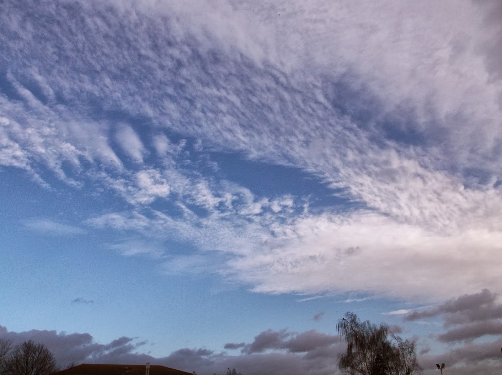
This photo doesn't follow the rule of thirds much, but the majority of the clouds are in the right of the photo. In this photo I concentrated on textures; the fluffy clouds, the smooth blue sky, and the trees.

Thursday, 23 January 2014

Organising Photos


I have organised all of the photos I've put onto the blog into separate folders based on what the photo is. This means I can find the photo again later if I need it.

Monday, 20 January 2014

Adjusting an Image


This is the original image that I decided to edit.
I opened the photo in Photoshop. I then duplicated the background layer. I made this duplicate hidden. I made the original background black and white, and then un-hid the duplicate background. I selected the coloured image and opened the colour range options. Using the eyedropper, I selected the red-orange colour of he frogs eyes and toes. I copy and pasted this selection to create a new layer, and deleted the colour background layer. This then left me with this photo which I saved a a JPEG.

For this one I liked the black and white effect because it makes the frogs eyes stand out, and it also draws attention to his toes. I think this focus on the eyes and toes is good because the toes and eyes are unusual and interesting due to their amphibian-like pupils and toe pads.
This is another example of the house from Up. In this photo there are a lot more colours selected. For this I had to create a lot of layers and be careful about cleaning up unwanted bits that have been selected in the process.

For this one I liked the effect because it draws attention to the balloons. There's lots of colour on the balloons which contrasts well with the black and white background.

For this one I highlighted the eyes because it's the most colourful part of a person and is the first place most people will look. It's also a smaller part of the picture compared to the other two, which creates a slightly different effect.


Thursday, 16 January 2014

How to Upload/Manipulate/Store Photos

I created this flow diagram showing how to transfer images from a phone or camera into a computer and how to manipulate them. I followed the steps on this diagram to take a photo of it with a camera and upload it to this blog to prove that I can carry out these steps.

Thursday, 9 January 2014

The Rule of Thirds

I took a photo that was framed badly, and didn’t follow the rule of thirds. The main subject of the photo was in the centre of the image.

I then opened this in Photoshop and cropped it so that the main focus of the image was to the right of the photo. This means that it is now following the rule of thirds. I then added in the divider lines to show this. The main focus of the photo is mainly in the blocks to the left. This means it is no longer centred, making it framed better. The rule of thirds is used because when people look at a photo, their eyes are usually drawn towards the sides of the photo. Due to this, if you put the main focus in the centre of the image, people won’t look at it straight away. Whereas if you follow the rule of thirds and keep the main focus out of the centre, it will be seen faster by the viewer and makes for better framing.

School Photos

I like this photo because of the way the ivy frames the sides. Unfortunately, our school isn't very colourful (especially in this winter) so colours aren't as evident in these photos.

I like this photo because of how the grey seagull stands out against the white-coloured sky. I also like how the branches of the tree are silhouetted against the sky in a pattern.

I think this photo has a more 3D aspect to it, and I think this makes the photo look better. I like the way the building takes p most of the shot, and the use of lines in this photo.

This photo has a nice pattern in it, with the way the bricks are arranged. It also contains a lot of textures which make me like this photo; the rough brick wall, the smooth windows, the grass and the leaves.