Thursday 12 December 2013

School Photos

I like the patterns that this photo creates. The square spiral is interesting, more so than a normal curved spiral. I also like the effect the banisters create that show depth in the photo.
I like this photo because of the amount of lines in it that make it so interesting. They all form a sort of pattern, the straight lines and criss-cross pattern on the walls of the school, and the blocky tiles.

The colours in this photo are dark, which I think fits  with the old building. I also like the textures that you can see. The fluffy clouds contrasts the rough, broken texture of the building.
This photo is very colourful, and I like the fact that they're so vibrant and varied. Even the sky sky and the bricks of the building are brightly coloured.

Monday 9 December 2013

Improving Patterns, Textures, Lines and Colours

I've edited my cropped photo of myself to better show patterns, textures, lines and colours. This one is to show patterns with the different blocked sections that the filter has created. The filter used for this photo was "stained glass". I like this effect because the shapes turn into honeycomb-like patterns.
This was done to show textures with the rough pencil marks and the smooth sections, for example on the computer screen. For this one I used the "coloured pencil" filter. I like this because of the variation that it creates within the photo.
This one shows lines in a photo with the square blocks creating lines through the picture. I did this by going into the filter menu of Photoshop and choosing the "patchwork" option. I like this because some of the squares stand out more than others giving it a 3D effect.
I've edited this to show colours in a photo by making the colours brighter and more varied. I did this by altering the hue/saturation. I like this because of the interesting effect the new colours give the photo.

Thursday 5 December 2013

Cropping in Photoshop

For this photo I just took it with Photo Booth with no editing whatsoever.

For this one I then went into Photoshop and cropped the original to this size to improve the photo.

Monday 2 December 2013

Elements of a Photo

This photo shows off patterns quite well. The pattern of the tigers fur is the obvious point, but this photo is also very symmetrical making it more aesthetically pleasing.
Colours are shown well in this picture. The chameleon itself is very vibrant and varied in colour, and the leaves and background are also nice, bright colours that don't clash.

This is a good example of the use of lines in a photo. In this one it adds perspective, the lines of the runway drawing the photo away to the horizon, and the straight horizon and the plane wings line up very nicely.

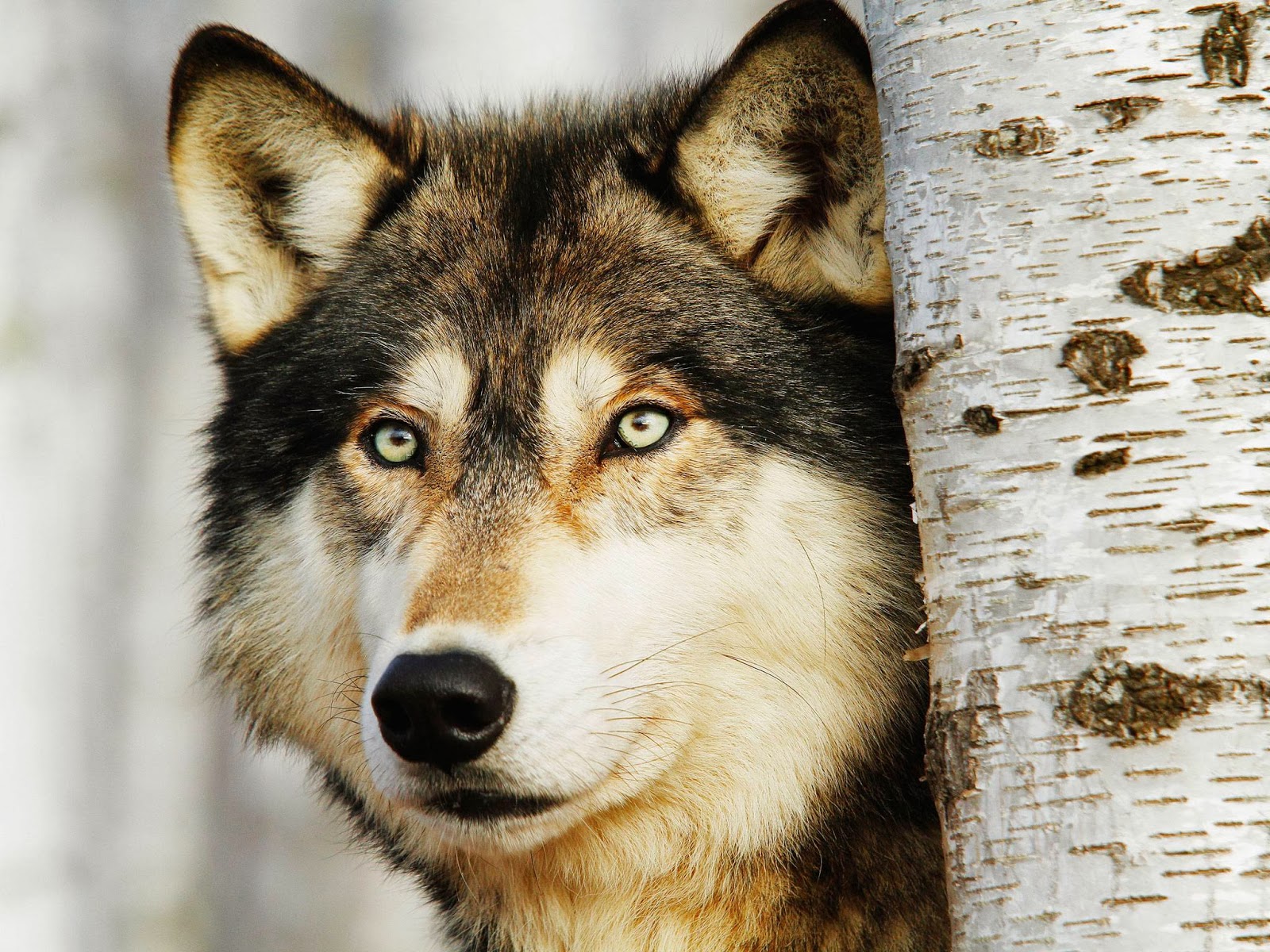
I think that the textures of this photo contrast nicely. The bark of the tree looks rough, yet the wolf stood next to it has a fluffy texture, and the nose looks slightly wet and smooth.