 |
| This photo shows off patterns quite well. The pattern of the tigers fur is the obvious point, but this photo is also very symmetrical making it more aesthetically pleasing. |
 |
| Colours are shown well in this picture. The chameleon itself is very vibrant and varied in colour, and the leaves and background are also nice, bright colours that don't clash. |
 |
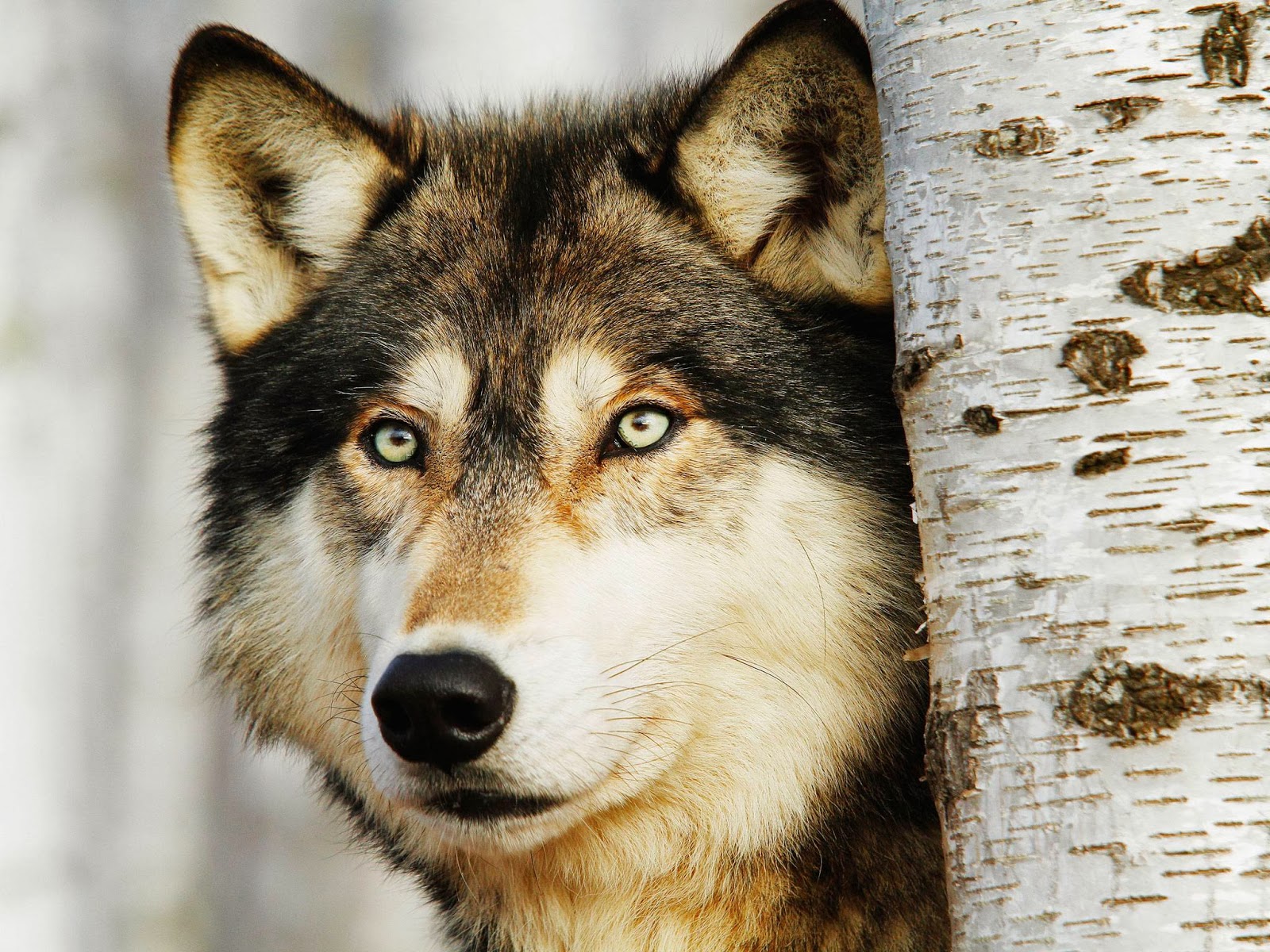
| I think that the textures of this photo contrast nicely. The bark of the tree looks rough, yet the wolf stood next to it has a fluffy texture, and the nose looks slightly wet and smooth. |

No comments:
Post a Comment